Refine & Organise
With all of the images I have taken and edited, it was now time to organise them! In this weeks tutorial we were assigned to convert all of our edited images onto Adobe Indesign to create a proof sheet.
Down bellow is what I have created so far.


The lecture and tutorial were both focused on the power of ‘Colour’ and how we can effectively use it as a tool in our posters. Like Visual Literacy, colour can be used to communicate ideas or emotions to an audience through tones, saturation, different temperatures and hues.
Looking at what I have made so far, I believe that the black and white edits of my images are the most powerful in terms of visual literacy (compared to the coloured edits). The dark tones complement the strong structures of each letter. Having the powerful use of contrast mixed with the gym-oriented objects in the images, inspires me to create some sort of hard-core action movie poster! Down bellow is a mind map of the themes and ideas I have for my final poster;
I’m beginning to rely more on the use of contrast, which I have noticed is commonly used in the movement of Constructivism. I’m finding that I’m spending more time on the black and white images and how to adjust the level settings of each photo to complement the shadows and white space shown. I’ve been looking more at Alexander Rodchenko’s work to understand how black and white features in an image can be emotive.

Focus on Illustrator
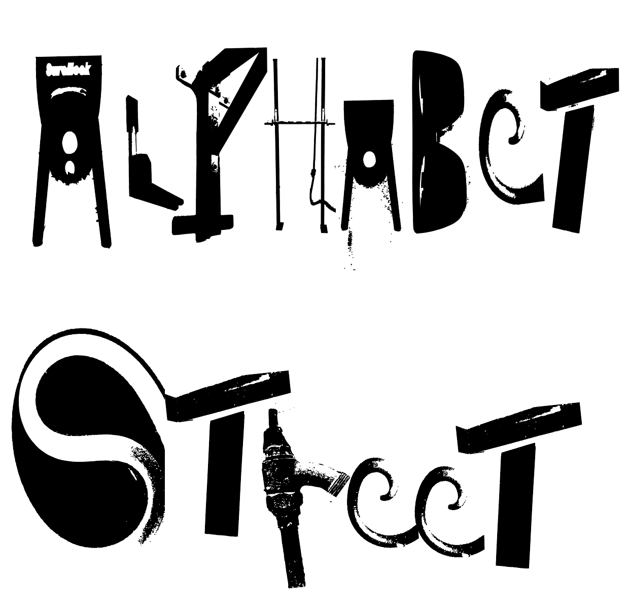
Within the next couple of days I completed my proof sheets. I took longer than I planned for I had trouble finding letters such as ‘y’ and ‘z’.
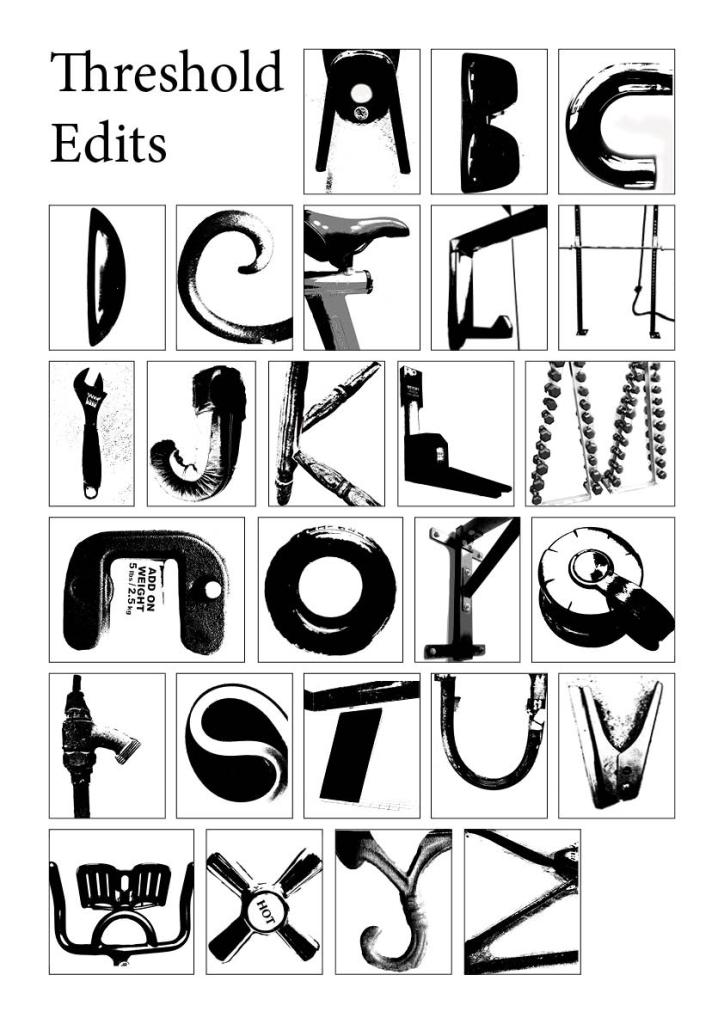
Today in the tutorial I was instructed to fix the document setting of my proof sheets. This was because I had them on the default settings. After updating my proof sheets, I began to experiment more the the Threshold tool. I had first used this tool in week two but I had only used it on a few of my images. I wanted to use this tool for all of my letters for I believe that distorts the images more thus enhancing the structure of each letter. Down bellow you can see the difference and how this tool makes each letter more distinct and readable. I noticed that Constructivist’s are very dependent on strong structures thus why it has become a main priority of mine for this task.

After this process I then transferred each letter to spell ‘ALPHABET STREET’ onto Adobe Illustrator, which can be seen down bellow. I ‘expanded’ each letter to change its setttings of a jpg to a vector graph. This is so I can edit each letter further without there being any pixelation.
I also used tools such as the ‘paint brush’ tool with a fill of white to use as an eraser to clean up the edges of some of the letters.

I’m still aiming towards a poster that represents a kind of ‘action-like’ theme. Today in the lecture we learnt more about design movements. Due to having a deeper understanding of Constructivism from my studies for my blog post ‘Week Two Research Task’, I will use techniques I’ve learnt from this era such as strong alignment and geometric elements in my poster.
Constructivism inspiration
Through what Ive learnt through researching the constructivism movement I recognise that it has repetitious use of geometric elements and has a strong sense of structure and alignment. I have began drafting my A1 poster and explored some geometric elements on the page. I had added a vector graph of an image I took last year of my brother playing basketball. I incorporated this along with other elements on the page because it helps communicate the street-style I’m aiming to display. Down bellow is some drafts I have created in my spare time.
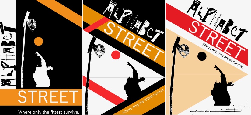
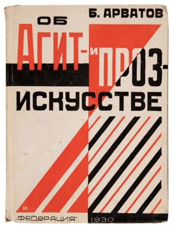
The colours I used was influenced by Rodchenko’s work ‘Ob agit i proz iskusstve’ (Rodchenko 1930). I also was influenced through the strong use of triangles and crossed over shapes. Although, I think I have personally tried to use too many elements to fill the poster. I will continue to use this composition layout of the second and third poster, but practice focusing on minimalism more.
I hope that the strong boldness of constructivism can be reflected within my action movie poster.
References
Rodchenko, A 1930, Ob agit i proz iskusstve, image, artnet, viewed 11 June 2019, <http://www.artnet.com/artists/alexander-rodchenko/ob-agit-i-proz-iskusstve-bk-by-boris-arvatov-2-m9KWBEH_4BJDaWMp25B8AA2>.
